DISCIPLINE
Brand Identity
Art Direction
CLIENT
KINN (Pitch)
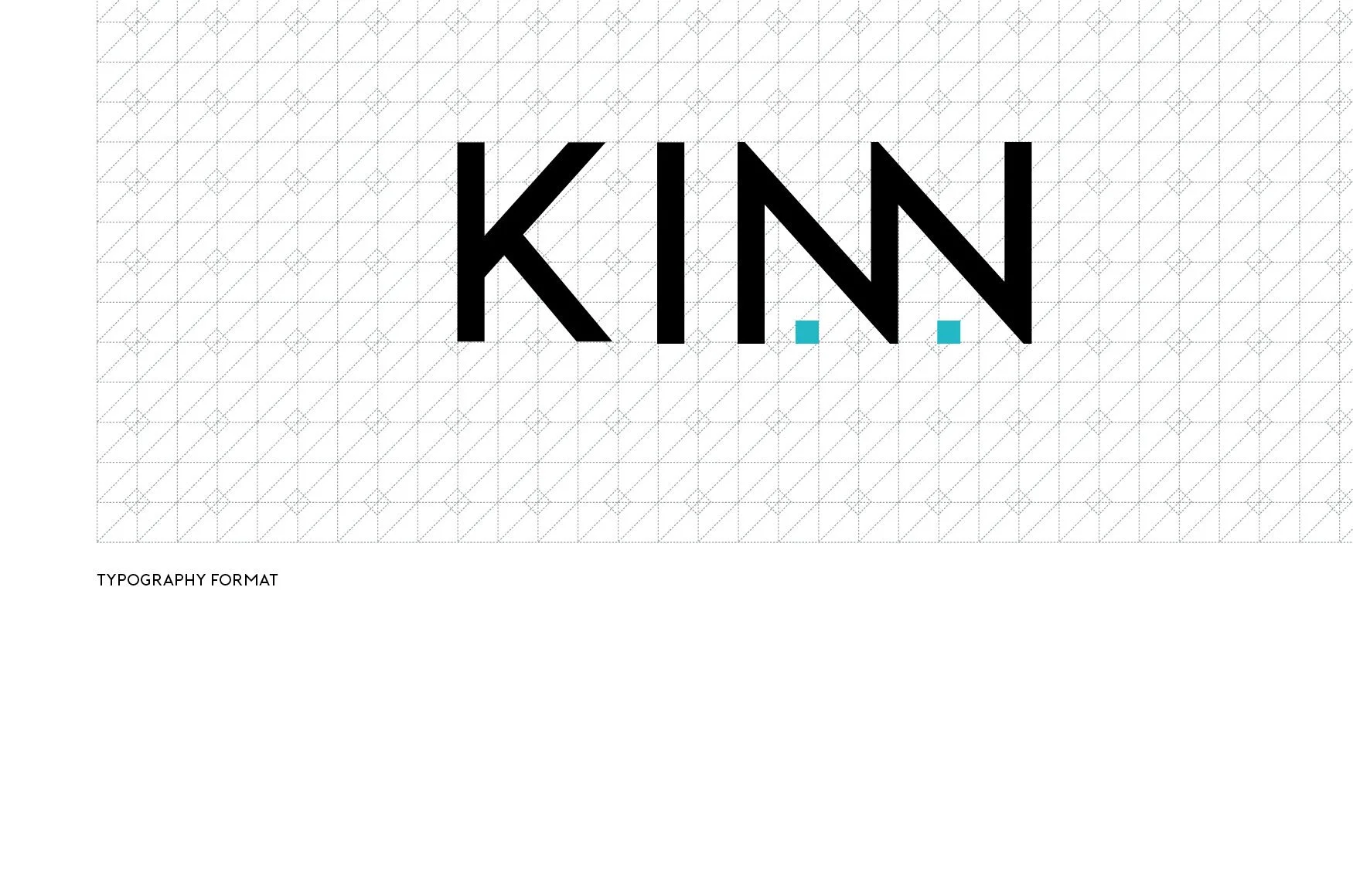
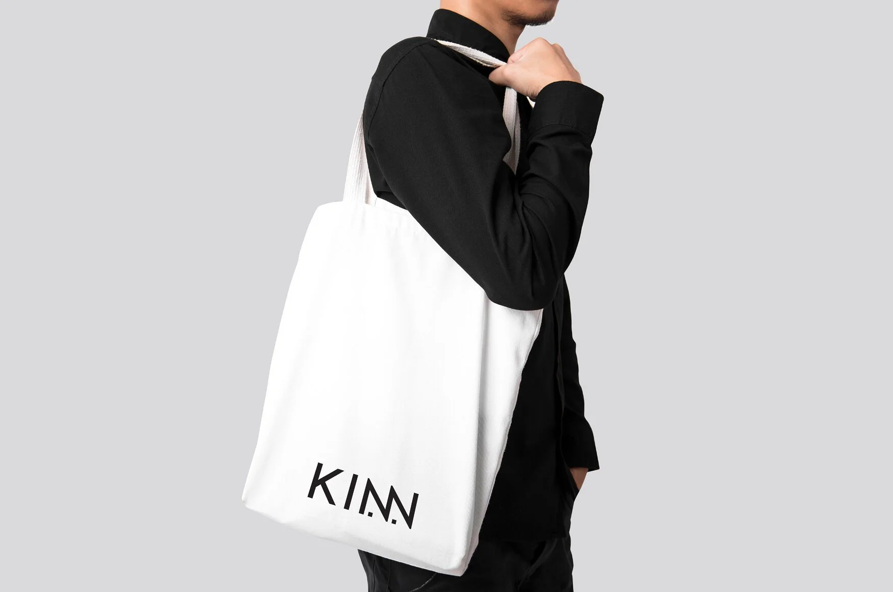
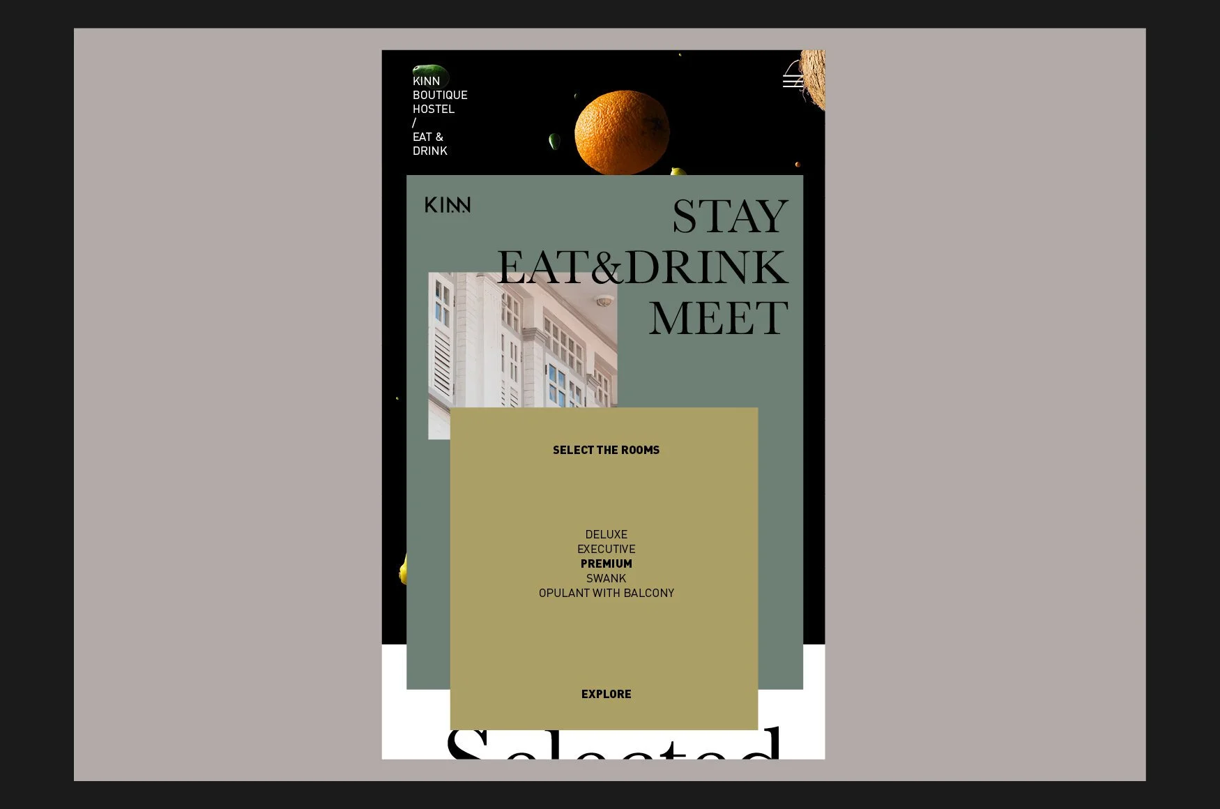
Communal Living. KINN : family, community (KIN) + lodging, hostel (INN).
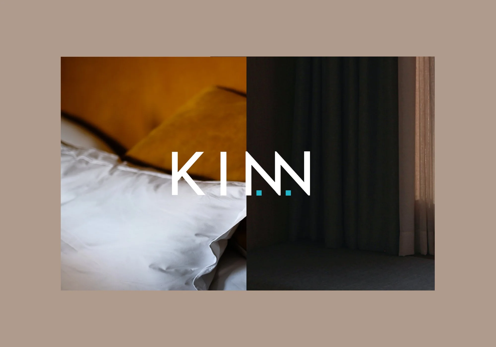

This new concept of communal living with shared amenities is catching on especially with millennials who want good experience with exceptional value. Our concept is to create a logotype using the double ‘N’ to symbolise a home away from home. The design approach is to communicate modernity and simplicity as it resonate with the values of KINN.
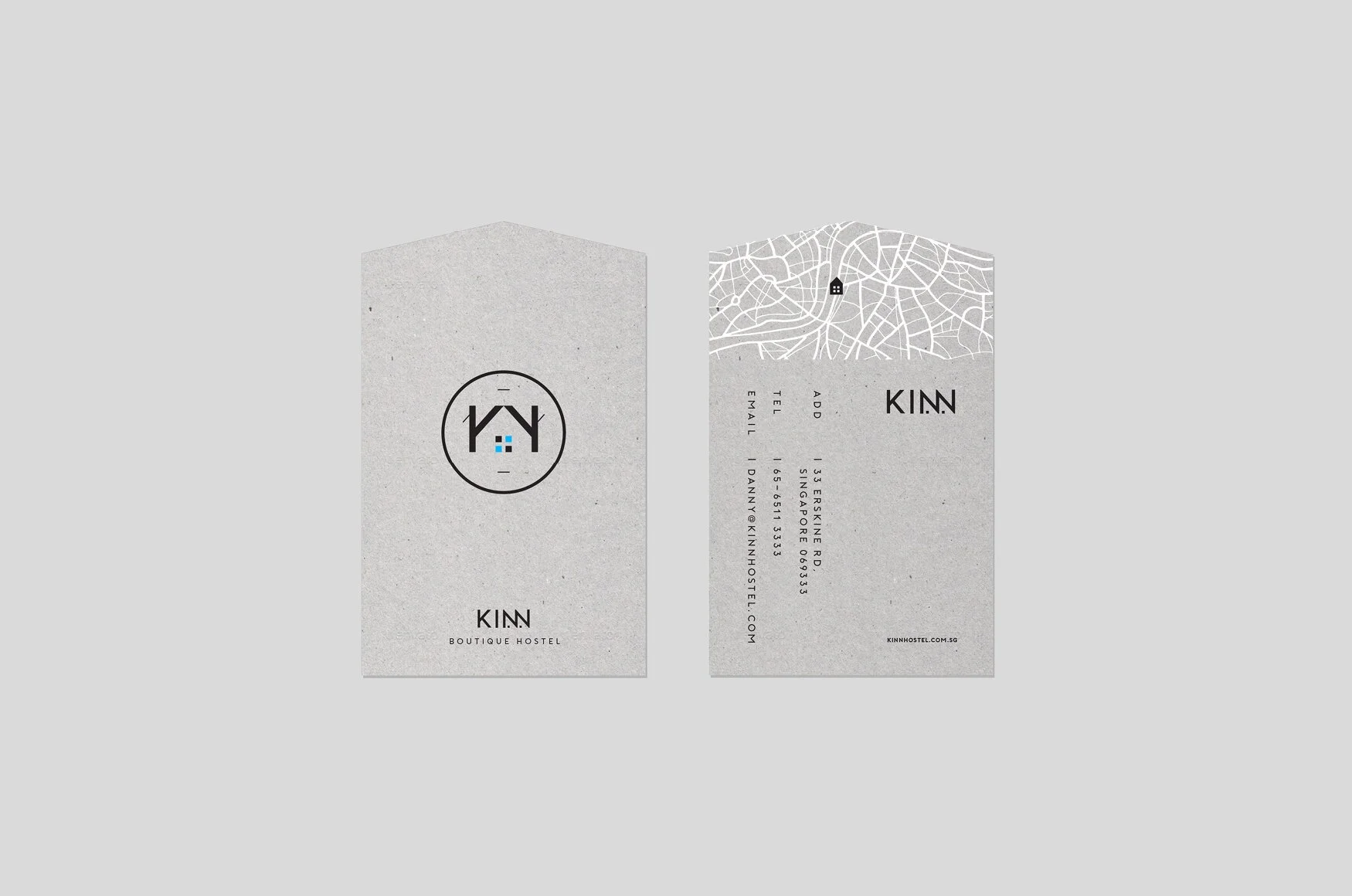
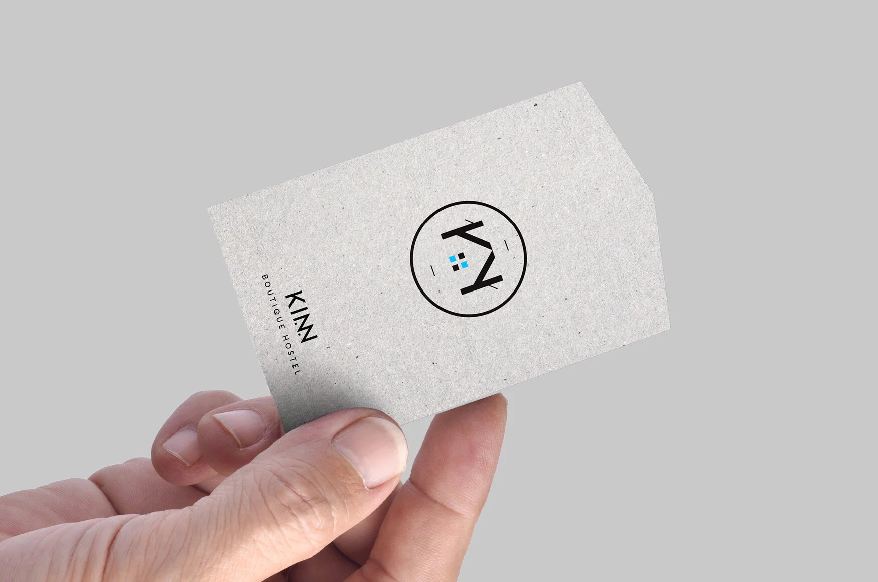
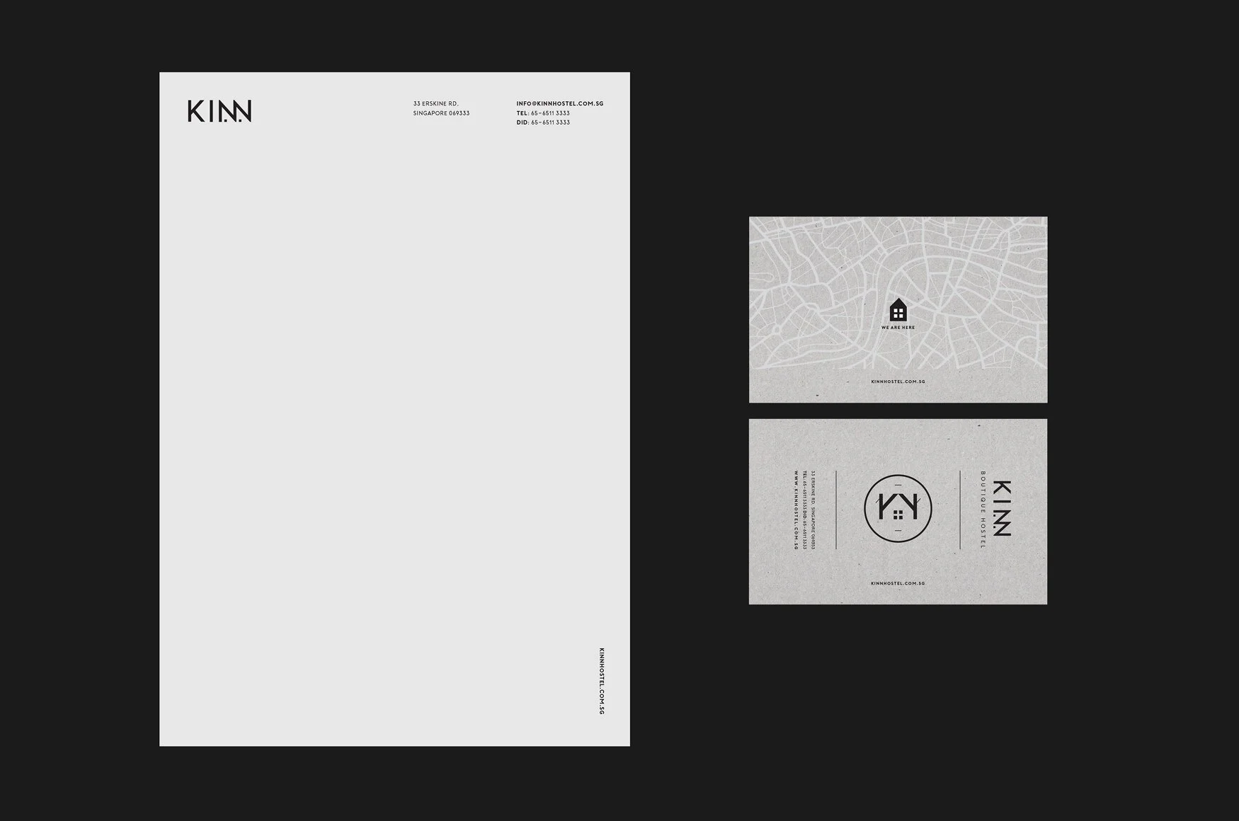
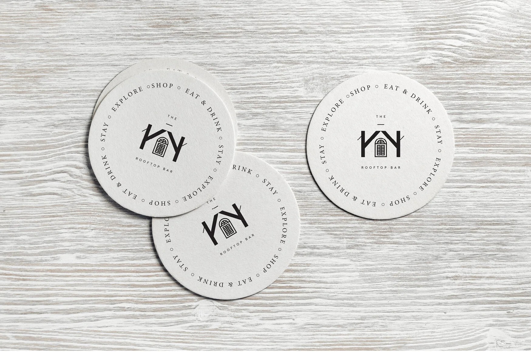
This execution approach is bold and unpretentious, making it absolutely fun to apply the logotype on a variety of collateral. It is highly visible and easy to recall. To supplement the logotype, a secondary logo is created to add a more playful vibe as well as the flexibility to also brand the key service areas within the premise such as rooftop bar or the concierge.